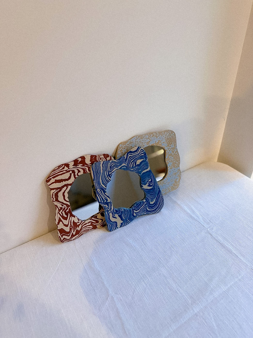
CERAMICS:
SHOP OUR ESSENTIALS


GRAPHIC DESIGN
Logo Design
Just the logo, nothing less.
A standalone logo tailored to your brand name, vibe and audience — for those who need a strong visual mark without the full branding package
(Re-)Branding
The full story — from brand voice to visual identity.
A complete brand concept including logo design, color palette, typography, tone of voice, brand icons, layout styling and guidelines. Ideal for new brands or existing ones in need of a fresh, consistent identity across all touchpoints — both print and digital.
Print Design
Printed designs that give form to brands and life’s special moments.
From business cards and packaging to wedding invitations and birth announcements — cohesive print design for both professional identity and personal milestones.
Online Design
Digital visuals that connect and convert.
Social media templates, email newsletters, digital flyers, branded content and other on-screen assets — designed to be consistent, engaging and tailored to your audience.
WHAT WE DO

IDEAS, SHAPED VISUALLY.
ateli.or
For ateli.or, we developed a visual identity that reflects the brand’s refined craftsmanship and modern elegance. The logo highlights the “OR” — French for “gold” — subtly reinforcing the brand’s artisanal foundation. Through a balanced combination of clean typography and delicate details, we created a branding system that feels both luxurious and approachable. The result is a visual language that mirrors the process of crafting jewelry: minimal, intentional, and beautifully executed.
ECH'o
For ECH’o, we developed a complete rebranding that clarifies the brand's identity and visual voice. The new logo is rooted in simplicity and balance, designed to feel confident yet understated. Across touchpoints — from business cards and stationery to banners and digital signatures — the identity is applied with consistency and restraint. The result is a cohesive branding system that reflects ECH’o’s values: clarity, intention and a quiet sense of refinement. Each element supports the whole, allowing the work to speak without distraction.
Sukoon Studio
For Sukoon Studio, we extended the existing visual identity into a cohesive set of print and social media materials that support the studio’s workshop-driven focus. Working with the established logo, color palette and illustrations, we designed folders, flyers, packaging stickers and placemats for sip & paint sessions. By applying the identity consistently across all touchpoints, the visuals reinforce Sukoon Studio’s warm, hands-on approach to ceramics. The result is a welcoming and recognizable presence that reflects the studio’s creative, community-oriented spirit.


